
Responsive Web Design: A Comprehensive Guide
Mobile web design
Before responsive web design became the norm, developers often focused on mobile web design or mobile-friendly design. These approaches aimed to ensure websites functioned effectively across diverse devices, accommodating varying screen sizes, resolutions, and performance capabilities. Essentially, they all shared the same goal: to create a seamless user experience across different physical attributes (screen size, resolution in terms of layout, content – text and media, and performance) of devices.
Responsive web design
HTML is fundamentally responsive, or fluid. If you create a web page containing only HTML, with no CSS, and resize the window, the browser will automatically reflow the text to fit the viewport. Although responsive design aims to handle different screen sizes well, it doesn’t always solve every readability issue. For instance, text lines that span the full width of a wide monitor can be hard to read. If we adjust the line length by using CSS to create columns or add padding, it might make the website look cramped when users view it on narrower screens or mobile devices.
Responsive web design (RWD) is an approach to web design aimed at making web pages render well on a variety of devices and window or screen sizes. In this blog, I will help you understand some techniques that can be used to master in RWD.

Why responsive design is important:
- Enhanced User Experience
- SEO Benefits
- Cost-Effective
- Increased Mobile Traffic
- Improved Conversion Rates
- High web page loading speed
Categories of RWD:
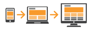
1. Mobile First Approach (Modern way): The Mobile First approach is all about prioritizing the mobile experience right from the beginning of the design process. Instead of starting with a full-sized desktop version, designers begin by crafting a website tailored for the smallest screen sizes. As the design evolves, they progressively enhance it for larger screens, ensuring a seamless and optimized experience across all devices. This method aligns perfectly with the growing trend of people using their mobile devices to access the internet, ensuring that users have a smooth and enjoyable experience, no matter how they choose to connect.
Mobile First Approach
Advantages:
(a) Performance: By focusing on essential content and functionality, mobile-first designs load faster and perform better on smaller devices.
(b) User Experience: The user experience (UX) is one of the most important aspects to consider. If you can improve that experience for your visitors, you will gain their loyalty and keep them coming back for more. However, a website that is too slow or hard to use will cause users to abandon it in a heartbeat.
(c) Less Code = Fewer Bugs: With a mobile-first approach to coding, website development starts with a simpler code used for mobile devices. A desktop-first approach, however, is the opposite. The complex code for desktop is written first, then overrides for smaller screens are added in. Styling for mobile-first helps to simplify your code, which prevents bugs in the future.
(d) Progressive Enhancement: As screens get bigger, you can add more features and enhancements, ensuring a great experience on any device.
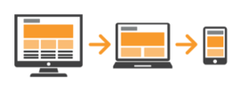
2. Desktop First approach (Traditional way): The Desktop First approach begins by designing a website for large screens like desktops and laptops. Once the design is set for these big screens, it is then scaled down to fit smaller screens like tablets and mobile phones. This was the standard method before mobile internet usage became so widespread. The idea was to create a detailed and feature-rich design for larger screens first, then simplify it for smaller devices.
Desktop First Approach
Advantages:
(a) Full Feature Experience: Desktop-first designs often take advantage of the larger screen space, allowing for more complex and feature-rich user interfaces. This approach makes it possible to include detailed graphics, extensive navigation menus, and a wealth of features that work well on bigger screens.
(b) Detailed Designs: With more space at their disposal, designers can get more creative and intricate with their design elements, offering a richer visual experience for users.
(c) Initial Focus on High-Resolution Displays: Designing for desktops first can lead to high-quality visuals and detailed interfaces suitable for users with larger screens and better hardware capabilities.
(d) Legacy Users: For some industries and user demographics, the desktop remains the primary mode of internet access. Serving this audience optimally might be essential.
Both the Mobile First and Desktop First approaches have their own advantages and can be chosen based on who the target audience is, what the project needs, and the design philosophy. The Mobile First approach is great for projects where most of the traffic comes from mobile users. On the other hand, the Desktop First approach works well for projects that require rich, complex interfaces on larger screens. Choosing the right approach depends on understanding where your audience is and what kind of experience they need.
Here are some key techniques and principles used in responsive web design:
Prerequisites: HTML basics and an idea of how CSS works
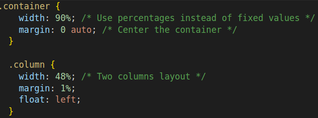
1. Fluid Grid Layouts:
Instead of using fixed pixel values, fluid grids use relative units like percentages to define widths. This allows the layout to adapt to different screen sizes.
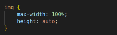
2. Flexible Images:
Images should scale with the size of the viewport to prevent them from breaking the layout.
3. Media Queries:
Media queries are a feature of CSS3 that allow you to apply styles based on the characteristics of the device rendering the content, such as its screen width, height, orientation, and resolution. This enables you to create responsive designs that adapt to different devices, ensuring a consistent and optimal user experience across a variety of screen sizes and environments.
With the wide variety of screens and devices, each having different heights and widths, it’s challenging to create exact breakpoints for each one. To simplify, you can target five groups:
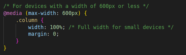
- @media only screen and (max-width: 600px) {…} -> Extra small devices (phones, 600px and down)
- @media only screen and (min-width: 600px) {…} -> Small devices (portrait tablets and large phones, 600px and up)
- @media only screen and (min-width: 768px) {…} -> Medium devices (landscape tablets, 768px and up)
- @media only screen and (min-width: 992px) {…} -> Large devices (laptops/desktops, 992px and up)
- @media only screen and (min-width: 1200px) {…} -> Extra large devices (large laptops and desktops, 1200px and up)
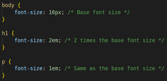
4. Responsive Typography:
Using relative units like “em” or “rem” for font sizes ensures that text scales appropriately on different devices.
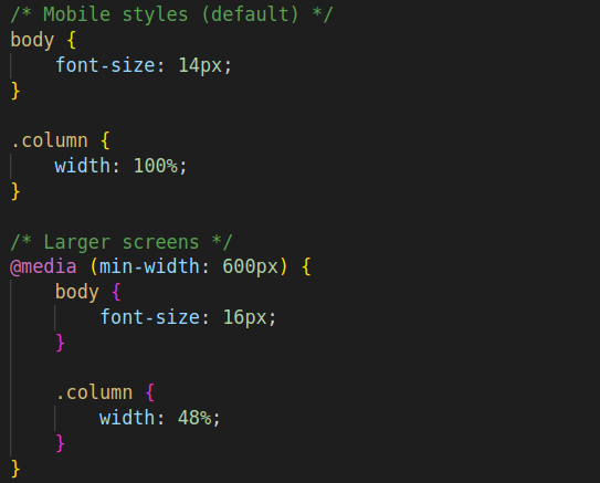
5. Mobile-First Approach:
Designing for the smallest screen first and then progressively enhancing the design for larger screens ensures a more robust and adaptable layout.
6. Viewport Meta Tag:
Including the viewport meta tag in the HTML document helps control the layout on mobile browsers.
eg: <meta name=”viewport” content=”width=device-width, initial-scale=1.0″>
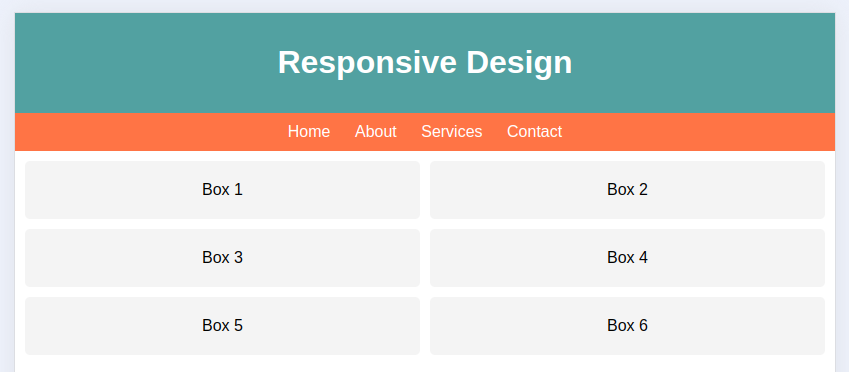
let’s see a whole example of responsive web design:
Code:
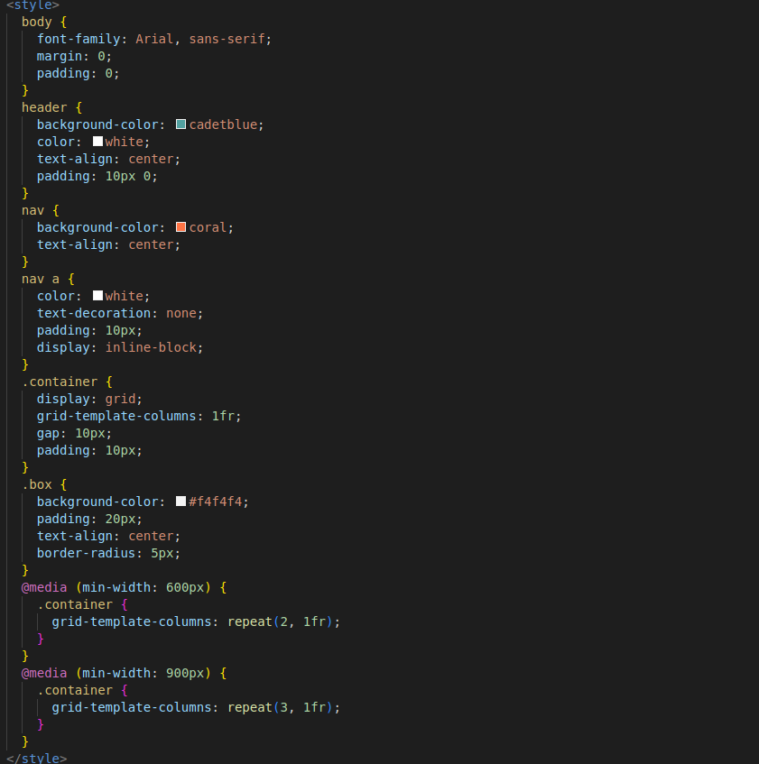
Result:

desktop
Tab
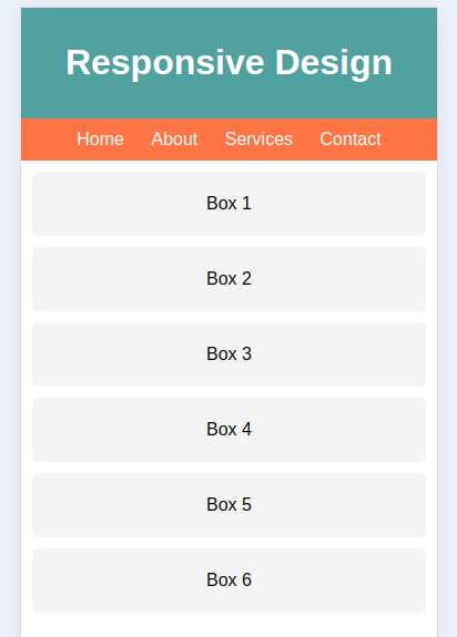
Mobile
Conclusion
Responsive web design is essential in today’s multi-device world, ensuring that websites are accessible, functional, and visually appealing across various screen sizes and devices. By employing techniques such as fluid grid layouts, flexible images, media queries, and a mobile-first approach, developers can create adaptable and user-friendly websites.