How to Create Aeroplane Animation to bring distinctive touch to your website

Demo of Aeroplane Animation
In the world of web design, CSS animations make websites look cool and interactive. CSS animations make boring web pages more attractive by adding small movements and fascinating effects. One of these effects is airplane animation. Now, most people know CSS Animation properties and can apply those to basic website animations. But I want to take an example of Aeroplane animation that shows how we can implement complex animations easily. Let’s have a look at how this effect is formed, its implementations, and its applications.
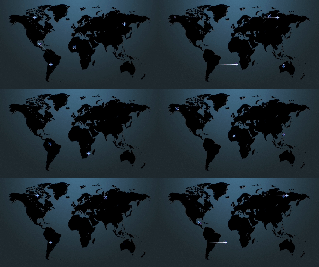
To begin with, we must visualize the final product: many planes flying over the background of a world map, creating the illusion of a flight taking off, passing through several nations, and landing in a different one.
Building the Aircraft
Start by creating a basic aeroplane shape using Scalable Vector Graphics (SVG). SVG is a vector file format which means you can scale the image easily and it will always be smooth and crisp. SVG can be created using Adobe Illustrator, Figma etc. We can create different parts of the aeroplane like the body, wings, and tail by SVG paths. We can also use various CSS properties like border-radius, transform, and box-shadow for a 3D look. Or SVG images can be downloaded from free SVG sites.
Putting aeroplane animations into practice
Keyframes in CSS can be used to specify an animation sequence. Firstly, break the animation into several segments like: Takeoff, Flying across the sky, and landing. Now, we want to split the time: first 30% for takeoff, next 30% to 70% for flying, and last 30% for landing. These timings can be varied as per your requirements.
1. Animating the aeroplane to simulate takeoff
Start by positioning the aeroplane at point 1. You may accomplish this by using fundamental CSS properties like position, top, and left. We may simulate takeoff by gradually altering the aeroplane’s scale from 0 to 1 between 0% and 30% of the flight time. This will give the impression that the plane is getting bigger.
.aeroplane {
  position: relative;
  width: 45px;
  height: 45px;
  margin-bottom: 20px;
  top: 250px;
  left: 200px;
 }

 .aeroplane .aeroplane-icon {
  position: absolute;
  right: 0;
  bottom: 0;
  transform: rotate(225deg);
  -webkit-animation: move-aeroplane 10s infinite;
  animation: move-aeroplane 10s infinite;
 }

 @keyframes move-aeroplane {
  0% {
    bottom: 10px;
    right: 10px;
    opacity: 0;
    transform: rotate(225deg) scale(0);
  }

  30% {
    bottom: 10px;
    right: 10px;
    opacity: 1;
    transform: rotate(225deg) scale(1);
  }
  ...
 }
2. Soaring Through the Sky
We may add more animation effects to our aircraft after it is in the air to replicate flight. This might include creating contrail to mimic the motion of flying through the air. To simulate movement, we want the aeroplane at point 1, and slowly move to point 2. You may achieve this by adjusting the CSS properties for the bottom and right.
@keyframes move-aeroplane {
  ...
  70% {
    bottom: 200px;
    right: 200px;
    opacity: 1;
    transform: rotate(225deg) scale(1);
  }
  ...
 }
Now for contrail, By defining keyframes for the flight path and applying them to the aircraft element, you can create a seamless animation that simulates flight.
In order to achieve this, we have created a line with CSS and added a gradient background so that it is darker towards the aeroplane and fades away in the other direction. Also, since we are simulating takeoff and landing during the first and last 30% of the time, we do not want this contrail during that time. Its opacity is therefore zero at that point.
While the plane is flying, we want to add a contrail, keep it for a while, and then fade it away. So timings are split accordingly. After the 30% that we set aside for takeoff, Add contrail for 15% of the time, hold it for the following 10%, and then fade it out for another 15% of the time, before we begin landing. We are changing opacity and width accordingly to make it look like an aeroplane has left a contrail.
.aeroplane .aeroplane-icon:after {
  position: absolute;
  right: 0;
  top: 15px;
  content: '';
  height: 1px;
  width: 0px;
  background: #ffffff;
  background: -moz-linear-gradient(left, rgba(0,0,0,0.09) 0%, #ffffff 100%);
  background: -webkit-linear-gradient(left, rgba(0,0,0,0.09) 0%,#ffffff 100%);
  background: linear-gradient(to right, rgba(0,0,0,0.09) 0%,#ffffff 100%);
  filter: progid:DXImageTransform.Microsoft.gradient( startColorstr='#000000', endColorstr='#ffffff',GradientType=1 );
  -webkit-animation: line 10s infinite;
  animation: line 10s infinite;
  animation-fill-mode: forwards;
 }


 @keyframes line {
  0% {
    width: 0;
    opacity: 0;
  }


  30% {
    width: 0;
    opacity: 0;
  }


  45% {
    width: 100px;
    opacity: 1;
  }


  55% {
    width: 100px;
    opacity: 1;
  }


  70% {
    width: 0;
    opacity: 0;
  }


  100% {
    width: 0;
    opacity: 0;
  }
 }
3. Animating the aeroplane to simulate landing
Lastly, we’ll animate the aeroplane’s descent and landing. We can imitate landing by flipping the animation sequence of takeoff. By gradually changing the aeroplane’s scale from 1 to 0 from 70% to 100% we can simulate the plane shrinking in size and making a landing.
 @keyframes move-aeroplane {
  ...
  100% {
    bottom: 200px;
    right: 200px;
    opacity: 0;
    transform: rotate(225deg) scale(0);
  }
 }
Applications in Web Design
Aeroplane animations aren’t just visually attractive, they also enhance the overall user experience. These animations engage users, leaving an impression. Here are a few scenarios in which this could be useful.
- Travel Websites: Use aeroplane animations to showcase flight routes and their destinations, travel packages like multiple stop routes, and interesting visitors to begin their next adventure.
- Education Platforms: Integrate animated simulations of aeroplane mechanics or historical flights to enhance learning experiences and make complex concepts more accessible.
- Entertainment Portals: Create interactive games or storytelling experiences where users pilot virtual aircraft through immersive environments, adding an element of gamification and excitement.
- Add it to show your global footprints.
- Or simply adding an eye-catching effect to a landing page.
Conclusion
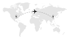
With some creativity and experimentation, we can make it look like planes are flying on our websites. These animations make websites more engaging and interesting. User experiences can be greatly enhanced by designers. The next time you come across a cool website animation, consider how it could be incorporated by dissecting it into several smaller components. Additionally, users can try animating aeroplane on the provided curved path.
TO THE NEW helps you build captivating user experiences that have a huge impact on customer satisfaction, brand perception, and conversion rates. Their experienced architects and visual interface designers leverage the best practices in UX research and design principles. Reach out for any queries.

Flight path Animation Exercise


