Dynamic CSS using AEM style system and custom tool
Summary
A business requirement in my project wanted specific users to reskin or restyle AEM components without needing deployment. We know that with the help of OOTB style systems, we can configure styles for the component, but it would still require code deployment. So, the solution was to build a tool allowing authorized users to upload CSS to a specific location in AEM and restyle or reskin AEM components with the help of OOTB-style systems.
Let me guide you through the steps that I undertook to develop the same.
Prerequisites
For this, you should
- Have basic knowledge of AEM-style systems
- Know how to create a custom tool in AEM
- Know how to write BEM-specific CSS
Steps taken to achieve the task
- Create a custom tool
- Write CSS with BEM notations
- Configure styles in the component
Create a custom tool
- First, we need to design a custom tool with the following features:
- Upload a CSS file to a specific location inside AEM. Example: – under /var/dynamic-css
- Delete a file under a specific location
2. To create a custom tool, please refer to this link.
Write CSS with BEM notations
- The Block, Element, Modifier methodology (commonly referred to as BEM) is a popular naming convention for classes in HTML and CSS. Developed by the team at Yandex, its goal is to help developers better understand the relationship between HTML and CSS in a given project.
Here’s an example of what a CSS developer writing in the BEM style might write:
/* Block component */
.cmp-title {}

/* Element that depends upon the block */
.cmp-title__text {}

/* Modifier that changes the style of the block */
. cmp-title__text --orange {}
. cmp-title__text --bold {}
In this CSS methodology, a block is a top-level abstraction of a new component, for example, a cmp-title: .cmp-title { }. This block should be thought of as a parent. Child items, or elements, can be placed inside, denoted by two underscores following the block’s name like .__text { }. Finally, modifiers can manipulate the block to theme or style that particular component without inflicting changes on a completely unrelated module. This is done by appending two hyphens to the block’s name, like cmp-title__text–orange.
Here is the example markup of the title core component.
<div data-sly-use.title="com.adobe.cq.wcm.core.components.models.Title"
     data-sly-use.template="core/wcm/components/commons/v1/templates.html"
     data-sly-test.text="${title.text}"
     data-cmp-data-layer="${title.data.json}"
     id="${title.id}"
     class="cmp-title">
    <h1 class="cmp-title__text" data-sly-element="${title.type}"><a
            data-sly-unwrap="${!title.link.valid || title.linkDisabled}"
            class="cmp-title__link"
            data-sly-attribute="${title.link.htmlAttributes}"
            data-cmp-clickable="${title.data ? true : false}">${text}</a></h1>
</div>
Configure styles in the component
- In AEM, navigate to Templates from Tools.
- Edit the template and go to component policy settings.
- Edit the policy of the Title component by tapping or clicking the Policy button.

4. On the Styles tab of the properties, you can see how the styles have been configured.

- Once the styles have been configured, click on Done.
- Now you need to create a client lib folder at the component level with a CSS file that has the below import statement (path pointing to CSS upload folder).
@import url("/var/../.. /title.css")
- Give a category name to the clientlib folder, say core.dynamic.title.styles.
- Now go to the template page policy.

- Add the category of the component clientlib folder in the properties tab.

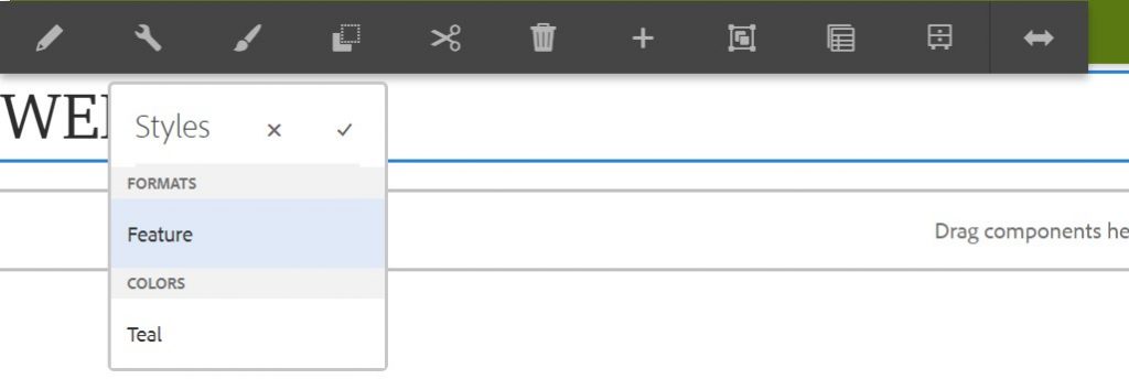
10. Now go to your page, click the paint brush icon, select the style, and apply.

- Once the style is applied, you can upload another CSS via the tool and reskin the component accordingly.


